Home
About
Contact
Gabriel Slade
Graphic Designer
Home
About
Contact
School Project
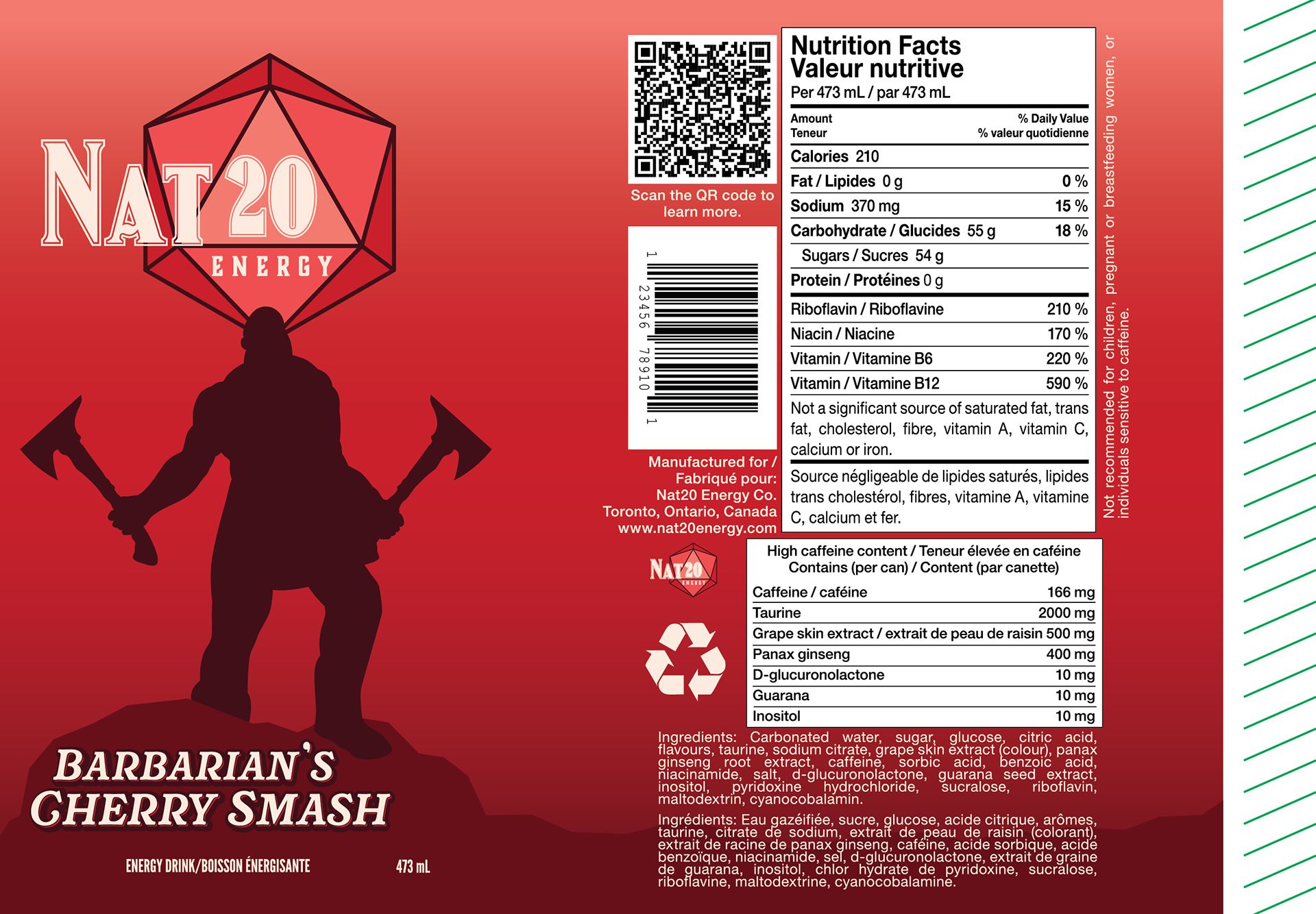
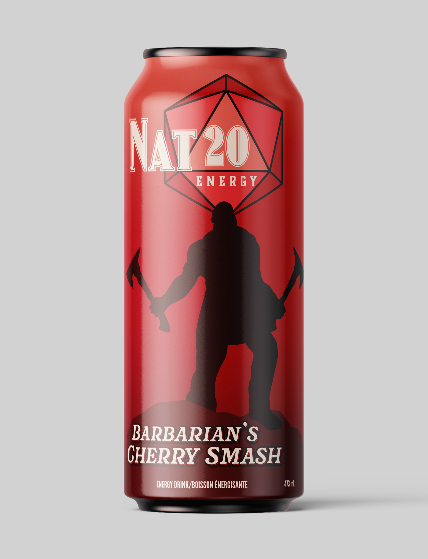
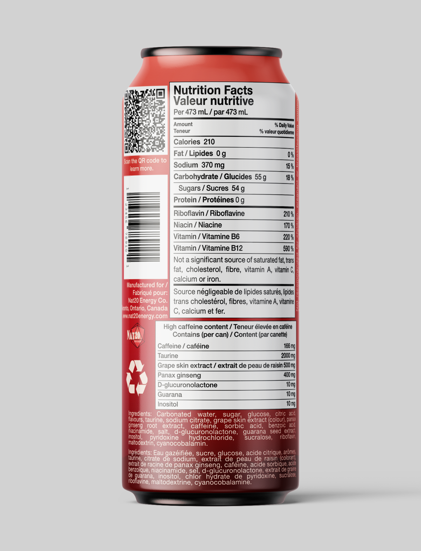
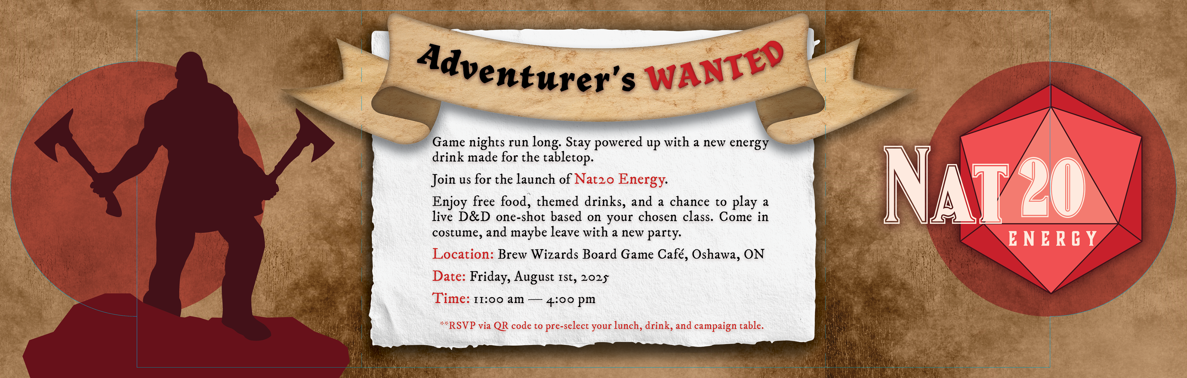
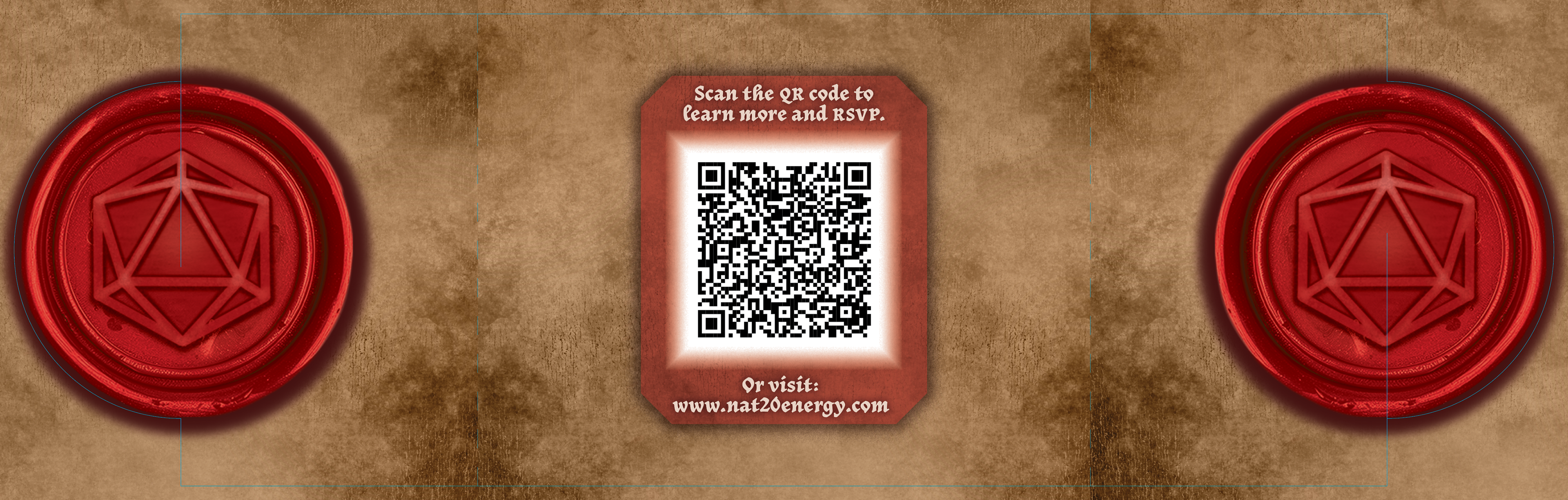
NAT20 Energy
Type of Work:
Packaging and Invitation Design
My Role:
Graphic Designer
Team:
Individual
Description:
WIP.
↑
Back to Top